Graphs examples

Contents
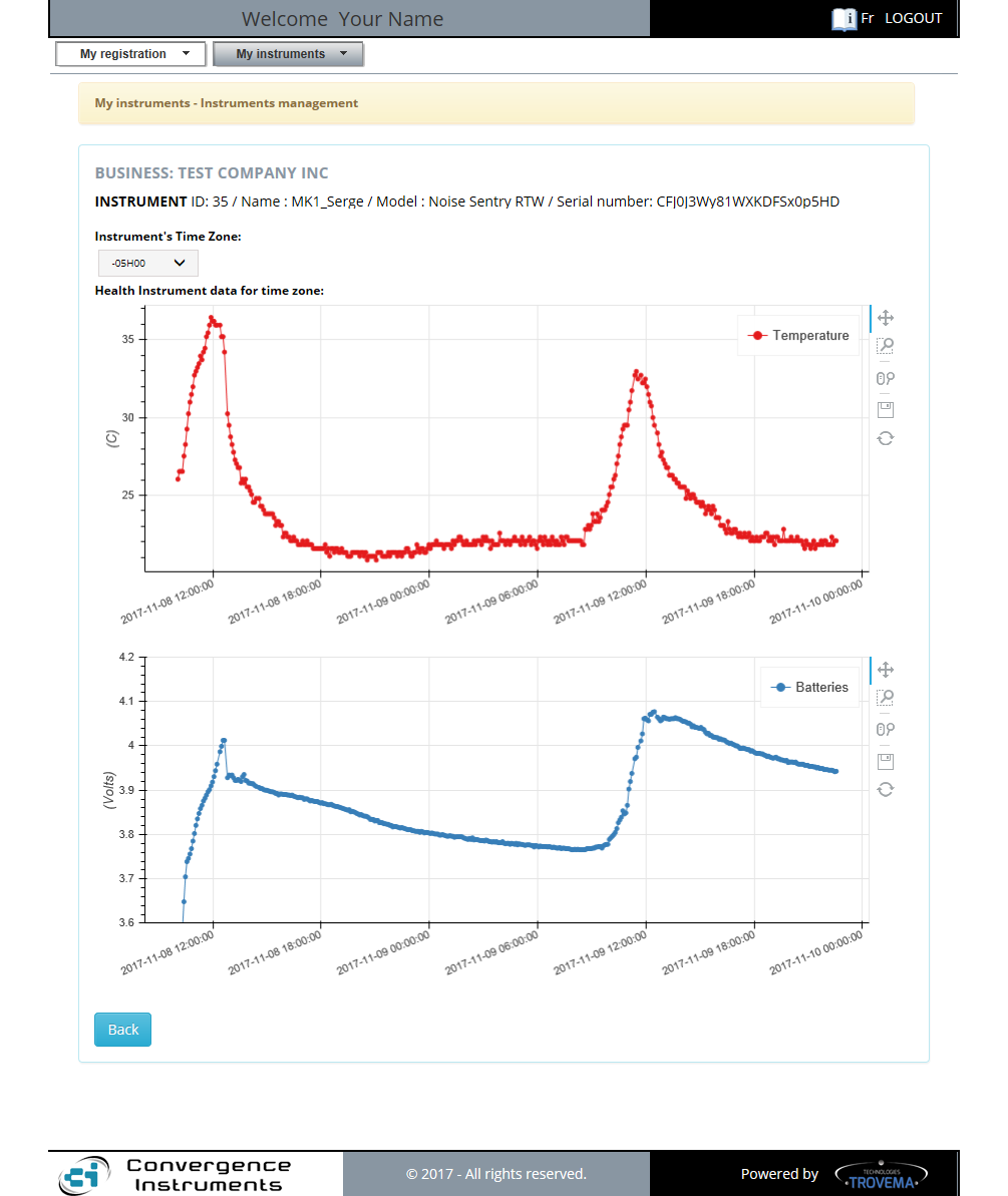
The Health graphs tool
In theory, the accumulation of Health data will never exceed the 28k figure, because it is limited to one single wlg file, not the instrument's life. Recording 16M of data would normally limit the data transfer to a number bellow 28k log intervals. |
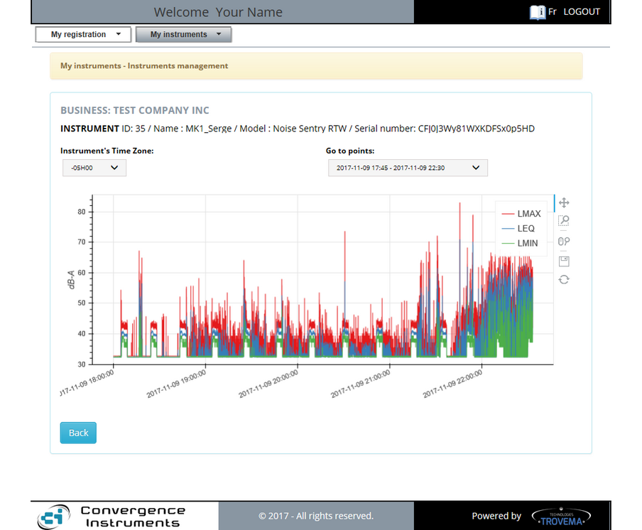
The Statistics graphs tool always show the recorded Noise data in the selected scale over time. Only 28k points for each of the three curves (Lmax, Leq and Lmin) can be shown at a time. The "Go to points" selector allows you to choose the specific period you are interested in. By default, the tool loads the most recent recording. |
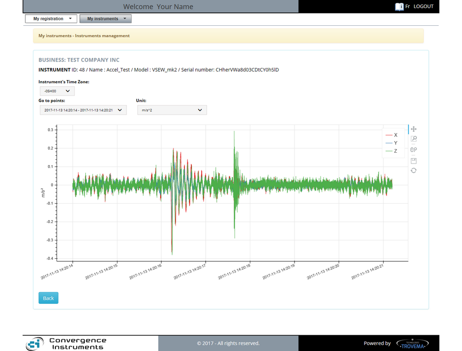
Raw Data for Acceleration graphs:
The Raw Statistics graphs can show up to three curves on the same graph. Those are the X; Y and Z. The "Unit" selector allows you to show the scale in "g" or "m/s^2 units over time. When more than 28k samples are available, the "Go to points" selector allows you to select the period to show on the graphs.
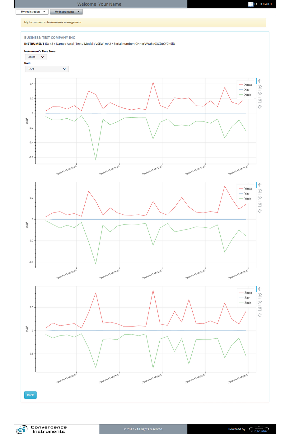
Peaks and Average Data for Acceleration graphs:
The Peaks and Average Statistics graphs can show up to three curves per axis. Those are the Xmax, Xavg, Xmin; Ymax, Yavg, Ymin and Zmax, Zavg et Zmin curves and graphs. The "Units" selector allows you to show the scale in "g" or "m/s^2 units over time. When more than 28k samples are available, the "Go to points" selector allows you to select the period to show on the graphs.
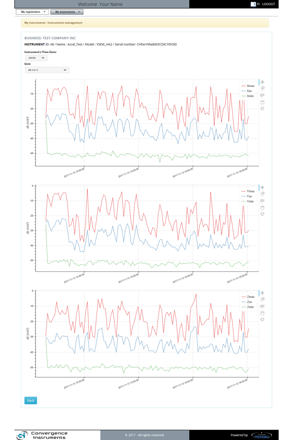
RMS Peaks and Average Data for Acceleration graphs:
The RMS Statistics graphs can show up to three curves per axis. Those are the Xmax, Xavg, Xmin; Ymax, Yavg, Ymin and Zmax, Zavg et Zmin curves and graphs. The "Units" selector allows you to show the scale in "dB -g" or "dB-m/s^2 units over time. When more than 28k samples are available, the "Go to points" selector allows you to select the period to show on the graphs.
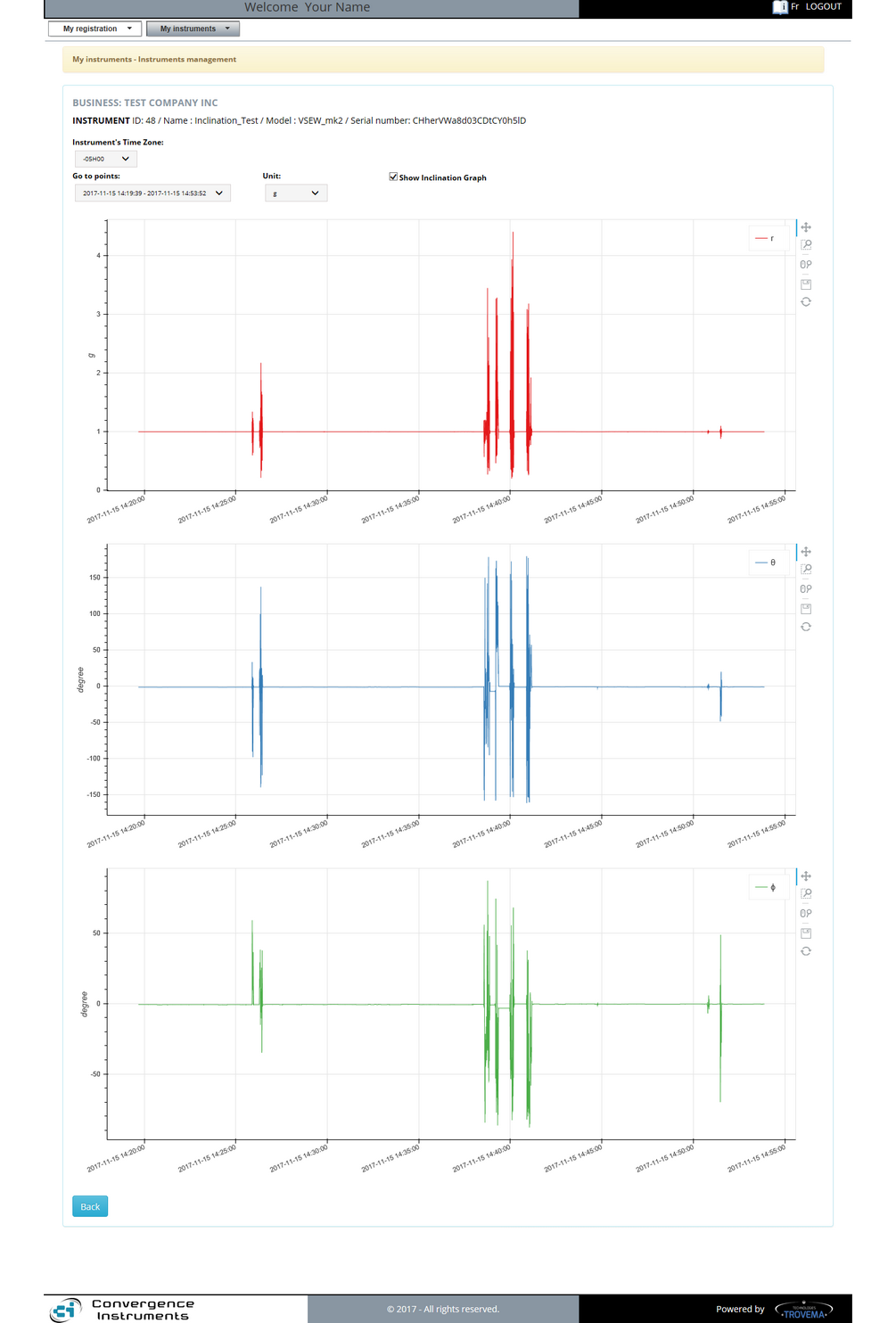
Inclination graphs:
The Inclination graphs converts the Cartesian values into Polar coordinates. Rho, Theta and Phi are shown on separate graphs. The Norm (Rho) can be shown in "g" or m/s^2 according to the "Unit" selector. Theta and Phi are given in degrees. When the recorded data exceeds 28k samples, the "Go to point" selector allows you to select the period to show on the graphs.
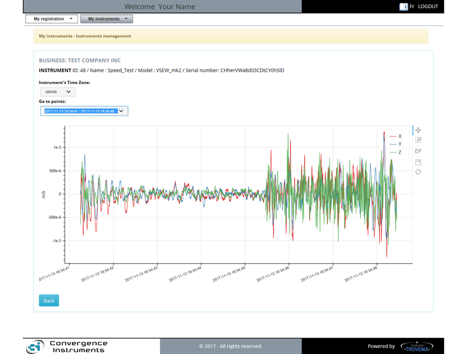
Velocity graphs:
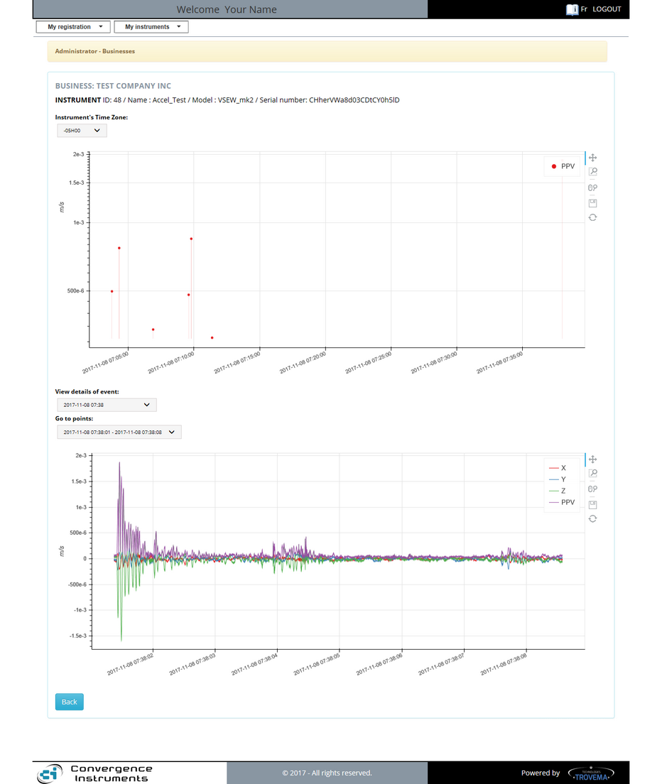
The Velocity Statistics Graphs shows the X, Y and Z curves in m/s for the period of time given by the "Go to points" selector. The graph tool will always load the latest period by default. |
The PPV (Peak Particle Velocity) graphs tool always gives two graphs:
|